A $300 million dollar yacht for a Russian oligarch, clearly inspired by Muppet Sam the Eagle. Bravo, Philippe!
Author Archives: CO
Whoever designed this bus bench ad is an asshole.
Gotta make church look cool to today’s kids! Let’s utilize mid 1990’s graphic design and typography – it will remind them of a time before they were born, when they were still just a gleam in Jesus’ eye.
A few other questions come to mind:
Why is the crucifix on its side? Is it meant to look like a crossbow?
What is that blurry image? People waiting in line at airport security?
What’s with the three seemingly unrelated bullet points at the bottom? “College. Miracles. Family.” Might as well be “Jellybeans. Scissors. Underpants.”
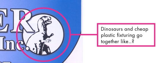
Whoever designed the Outwater Plastics catalog is an asshole.
One of the magical things about having your own business is receiving obscure trade catalogs in the mail:
Ever wonder where the shopping cart bumpers in the Walmart checkout aisle come from? Me neither! But now I know.
Let’s take a closer look, shall we?
Whoever designed these delicious moments is an asshole.
I was all set to write a post on the utterly baffling Enjoy Your Delicious Moments pizza box. But then I discovered that the Portland Mercury had done all the heavy lifting for me. Thanks, Mercury!
Whoever designed whateverthefucktheseare is an asshole.
Yes, Jeremy Scott, I’m looking at you. I don’t know who you’ve been sleeping with to hasten your ascent to the top of the fashion food chain, but that’s the only possible explanation for said ascent. Because it ain’t got nothin’ to do with talent or taste.

Karl Lagerfeld claims this guy is the only designer who could ever succeed him at Chanel. Coco must be rolling over in her grave.
Can’t get enough of the ugly? Here’s more!
Thanks to Jim Christensen for the submission.
Whoever designed this mailbox is an asshole (or an evil genius, I’m not sure).
Whoever designed these political bumper stickers is an asshole.
Let's revisit Bumper Sticker Design 101, shall we?
- The sticker should be legible from a distance.
- The sticker should be legible while in motion.
- The message should be succinct.
- The message should be easy to grasp in a split-second.
I was trying to change lanes on I-5 the other day and the pickup truck next to me wouldn't let me in. When I finally got behind him, I realized why:
(Yes, I have an Obama 2008 sticker on my - wait for it - Subaru.)
My first thought: is it a reference to the popular resort town of Bend, Oregon? Is the message a response to Obama's 2008 election, or a preview of the upcoming election? Is the bearer claiming that Obama is going to ream you? Or is it simply asking for help picking up some loose change off the floor?
The pickup truck sticker is a crowdsourced deal from Cafe Press. Here's the latest "official" Republican version:
[caption id="attachment_362" align="alignnone" width="350"] Oh hahaha! I get it! "Hope & Change" / "Hype & Blame"! CLEVER.[/caption]
And this, apparently, is the Romney campaign's latest:
[caption id="attachment_363" align="alignnone" width="545"]
 Hon, get me my reading glasses, wouldja?[/caption]
Guys. Do we need to review Bumper Sticker Design 101 again?
Whoever “designed” Potted Meat is an asshole.
I say "designed," because this is one of those "food" "products" which is surely the result of committees of corporate flavor profile engineers. It's not a food which is "prepared" from a "recipe." I'm not even sure it's food, quotation marks or not. My first encounter with Potted Meat came this past weekend when we were out longer than expected with the dog and needed to find him some food. The only shop in the vicinity was a sad, dusty little bodega. The shelves were nearly empty, widely spaced with the occasional home pregnancy test or bottle of Prell. Dog food was nowhere to be found, but I stumbled across a small stack of Potted Meat - quite possibly the most plentiful item in the shop. I expected raised eyebrows from the proprietor, but not over the fact that I presented a $5 bill for my $1.49 purchase. "You don't have smaller money?" he asked, peering over the counter into my wallet. After struggling to compute the correct change, he grudgingly added, "You take all my money!" And yet nothing about the disgusting product before us... The dog, of course, LOVED it. He's been very finicky ever since, no doubt longing for his pink, creamy, canned treat.
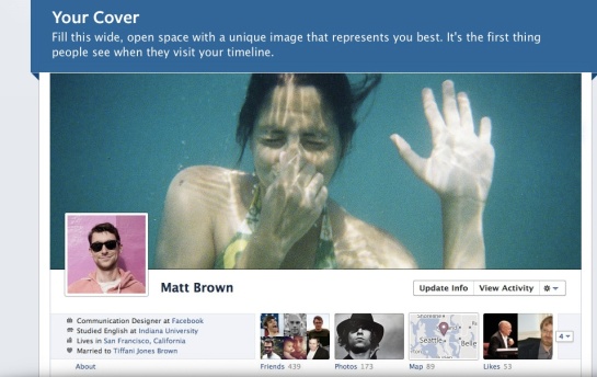
Whoever designed Facebook Timeline is an asshole.
Enough pixels have been spilled lamenting the crappy design of Facebook’s Timeline. It’s right up there with Florida’s infamous Butterfly Ballot in terms of its ease-of-use. So I wasn’t going to bother posting about it here. Until I stumbled across this article in the new issue of FastCompany.
Hey, who’s that guy perched awkwardly on the edge of the grey thing?
Why, it’s Nicholas Felton, of Feltron! The designer responsible for all those elegant, beautiful infographics which have graced the pages of countless publications. What’s he doing there?
Huh? He works for Facebook? He’s responsible for the Timeline layout? How is that even possible?
That’s funny – last year we contacted him to discuss commissioning a graph for a project, and he replied, “I very rarely accept marketing or advertising work, and don’t think that this project includes the informative or educational content I require to make an exception.”
What’s that you say? Facebook bought his company Daytum?
Oooohhhhhhh, now I get it!
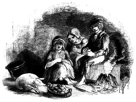
Whoever designed Trader Joe’s Saint Patrick’s campaign is an asshole.
“Eat like the Irish!” intone the green signs festooned about my local Trader Joe’s.


